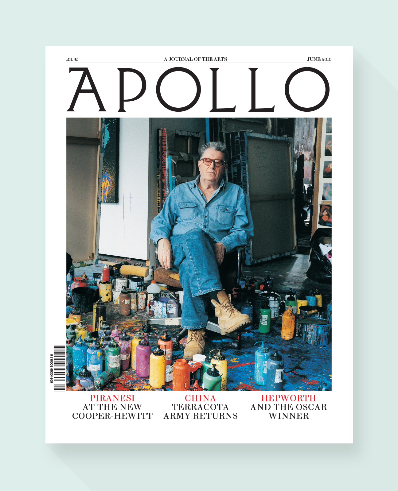
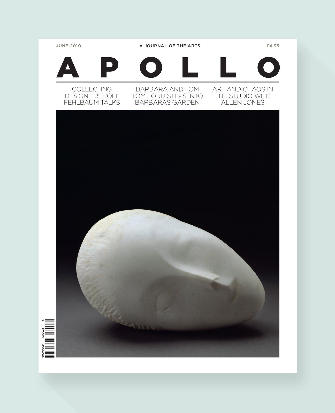
Apollo
Editorial
A pitch to redesign the international art magazine Apollo showing three options based on typeface choice.
Fonts : Brunel by Christian Schwartz, Gotham by Hoefler & Co. & Lyon by Commercial Type
![](https://www.jayglow.com/wp-content/uploads/2014/09/f-apollo-03.jpg)
![](https://www.jayglow.com/wp-content/uploads/2014/09/f-apollo-04.jpg)
![](https://www.jayglow.com/wp-content/uploads/2014/09/f-apollo-021.jpg)
![](https://www.jayglow.com/wp-content/uploads/2014/09/f-apollo-05.jpg)
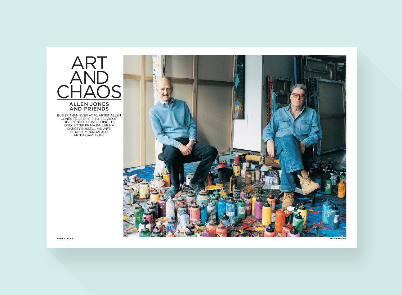
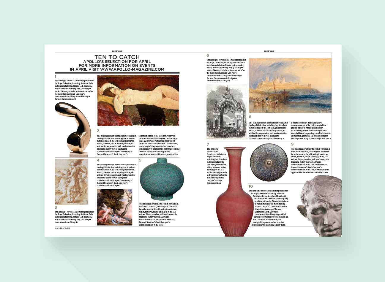
Route two used serif typefaces, creating a more traditional look & feel
![](https://www.jayglow.com/wp-content/uploads/2014/09/f-apollo-09.jpg)
![](https://www.jayglow.com/wp-content/uploads/2014/09/f-apollo-10.jpg)
![](https://www.jayglow.com/wp-content/uploads/2014/09/f-apollo-111.jpg)
![](https://www.jayglow.com/wp-content/uploads/2014/09/f-apollo-12.jpg)
![](https://www.jayglow.com/wp-content/uploads/2014/09/f-apollo-13.jpg)