
The Trade Mag Pitch
There are many types of magazine in the world. Some everyone has heard of, some no one has heard of and some that only very specific people have heard of. Today, I am thinking about specific people and their specific magazines; namely The Trade Magazine.
Unless you are in that trade, you’re unlikely to come across the industry publication, but there are loads out there. The variety is pretty expansive. I have worked on ones ranging from metal magazines full of information about where you can buy 100 tonnes of aluminum to health and safety magazines talking about the most common accidents which occur with fork-lift vehicles. There is something about the obscure subject matter some of them focus on which appeals to me.
It’s not your average glossy production. Don’t get me wrong. Big mainstream magazines are amazing to work on, they are like eating cake. But you can’t eat cake all day long. (Er… or can you?) And big titles suffer from problems too. They have big budgets yes, but they have a big readership that no one wants to annoy. They have a big team who want to be involved with a redesign. They have a big advertising team who need to ensure the advertisers stay happy. Sometimes the room to manoeuvre can be smaller than you would think.
On the flipside, trade magazines suffer from certain problems which larger circulation, big name magazines don’t have as much of an issue with.
- Lower budgets
- Smaller editorial teams
- Lower production values
- Poorer imagery
- More fractional advertising
So which is better? They’re both good projects and I like working on both. I have no prejudice. I remember once looking at a really great portfolio of work with my then art director. I remember exclaiming how amazing everything looked. The art director, however, did not share my awe. He might have rolled his eye at me, sighed and said; ‘An interesting subject, an amazing image, a big bit of type and lots of white space are all easy to make into something beautiful, but where is the challenge in that?’
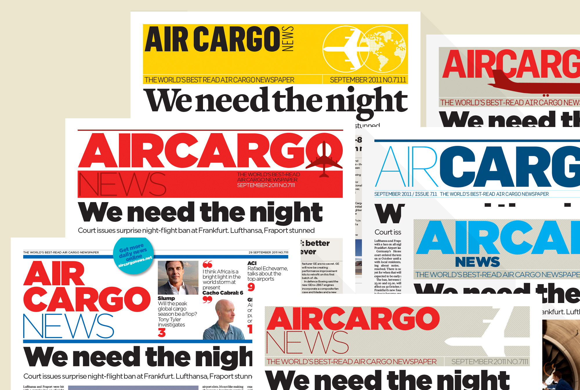
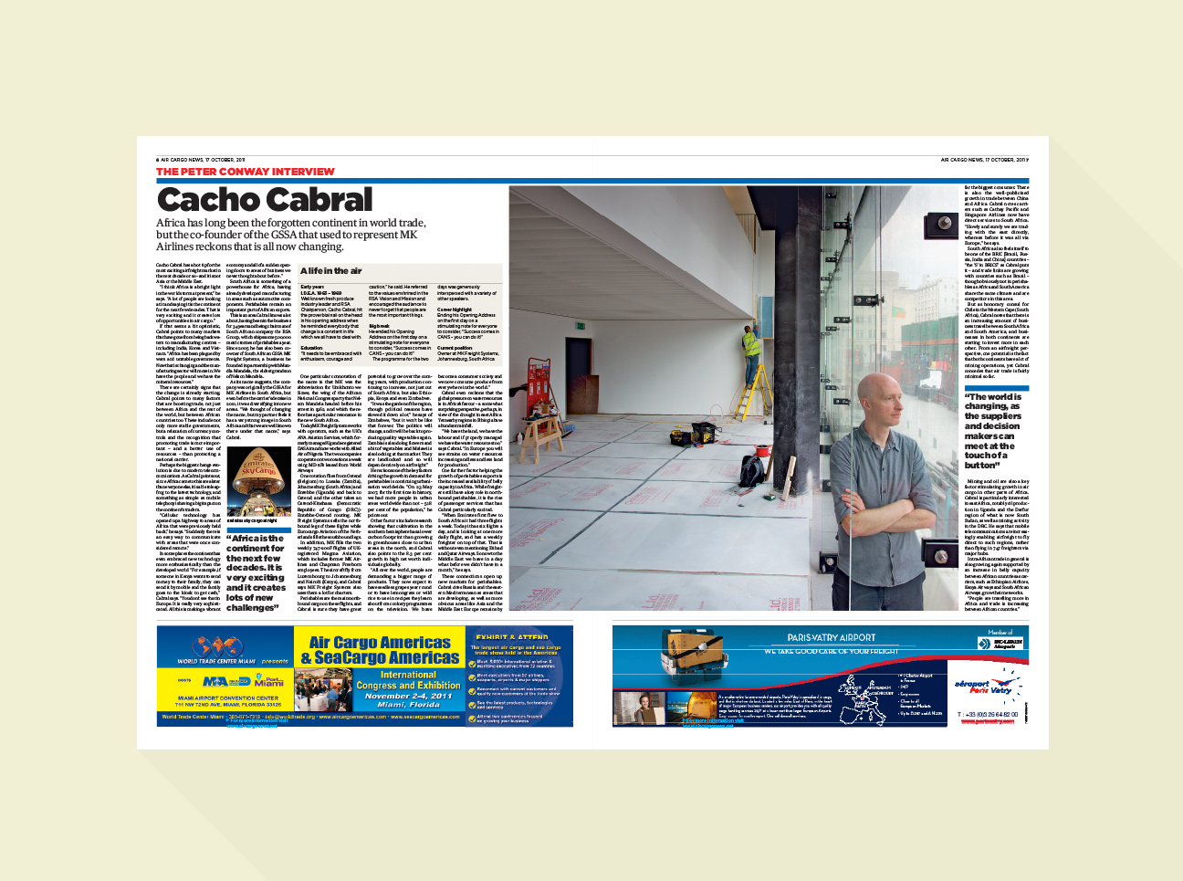
It took me a while to understand what he meant but I think I get it now. And I think it is why I like working on trade magazines sometimes. I thought I would show you a really old project which highlights some of the things I like about the ol trade mag.
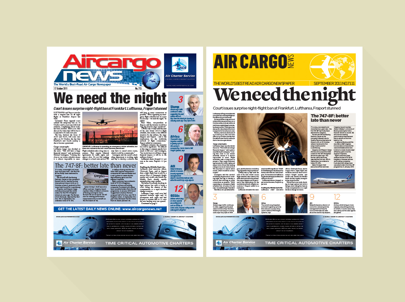
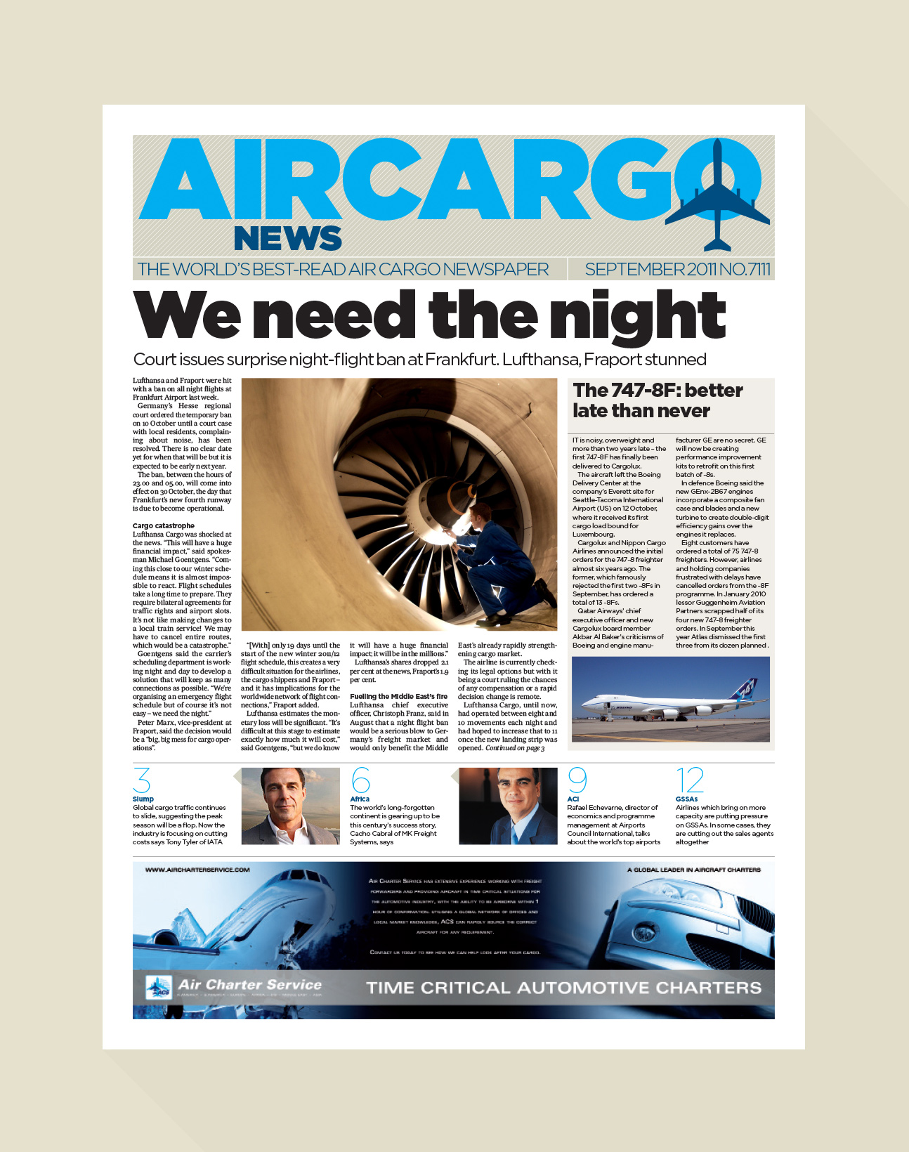
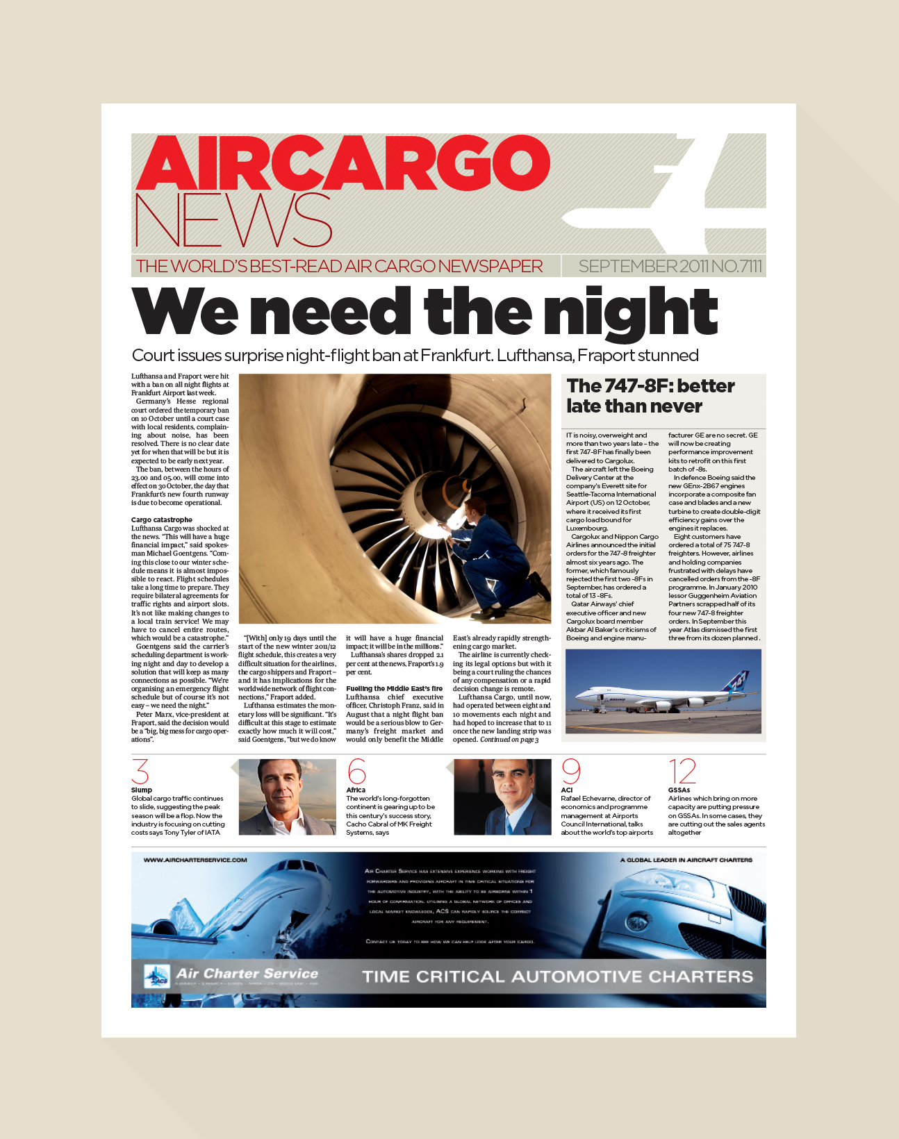
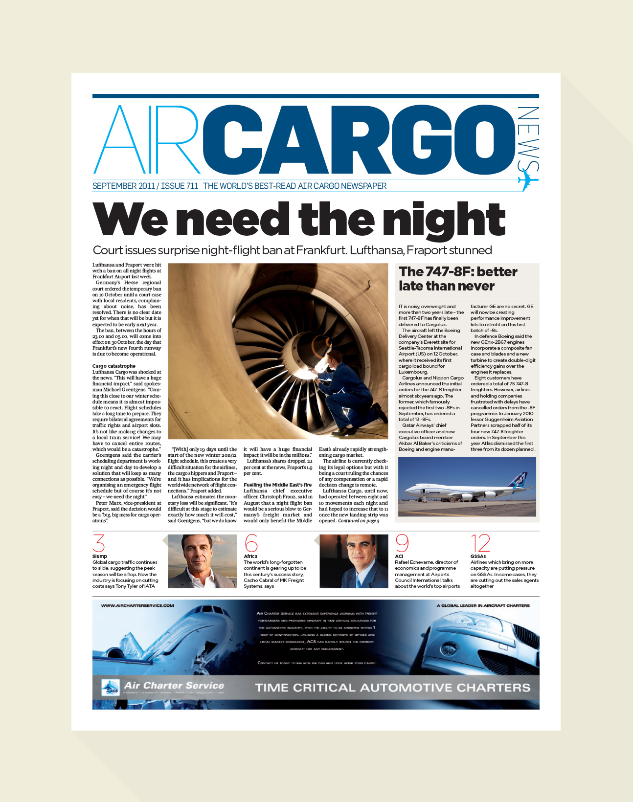
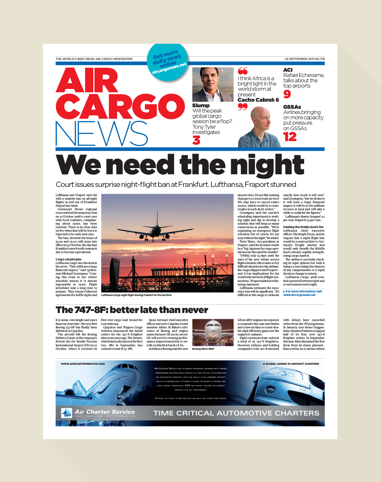
On the left is the existing design, on the right is my tweaked version with exactly the same content.
The Potential Room for Improvement
Trade magazine redesigns can be few and far between, sometimes you are looking at a design which is a decade old. Whenever I see the current design of a Trade mag I see the huge potential for improvement. I know that I can bring it right back into this century. Tastes change so much over time. One day a drop shadow and some three-dimensional type represent the future and the next it feels like a dodgy set from Blake 7.
It’s not a complete redesign
Often, the brief is not to shred the current design and gouge your eyeballs out so you never have to look at it again, reader’s need to remember what the magazine’s roots are. Meaning: Can we keep the globe and the airplane please? You often try to readjust thinking, persuade the client to drop some of the old thinking, try and wow them with a new idea. Sometimes that works. Sometimes it doesn’t. Often times you have to work with the existing furniture and the challenge is to try and make it better, as better as it can be without reinventing the wheel or making it look like a poster for Factory Records.
Words and pictures are like a jigsaw
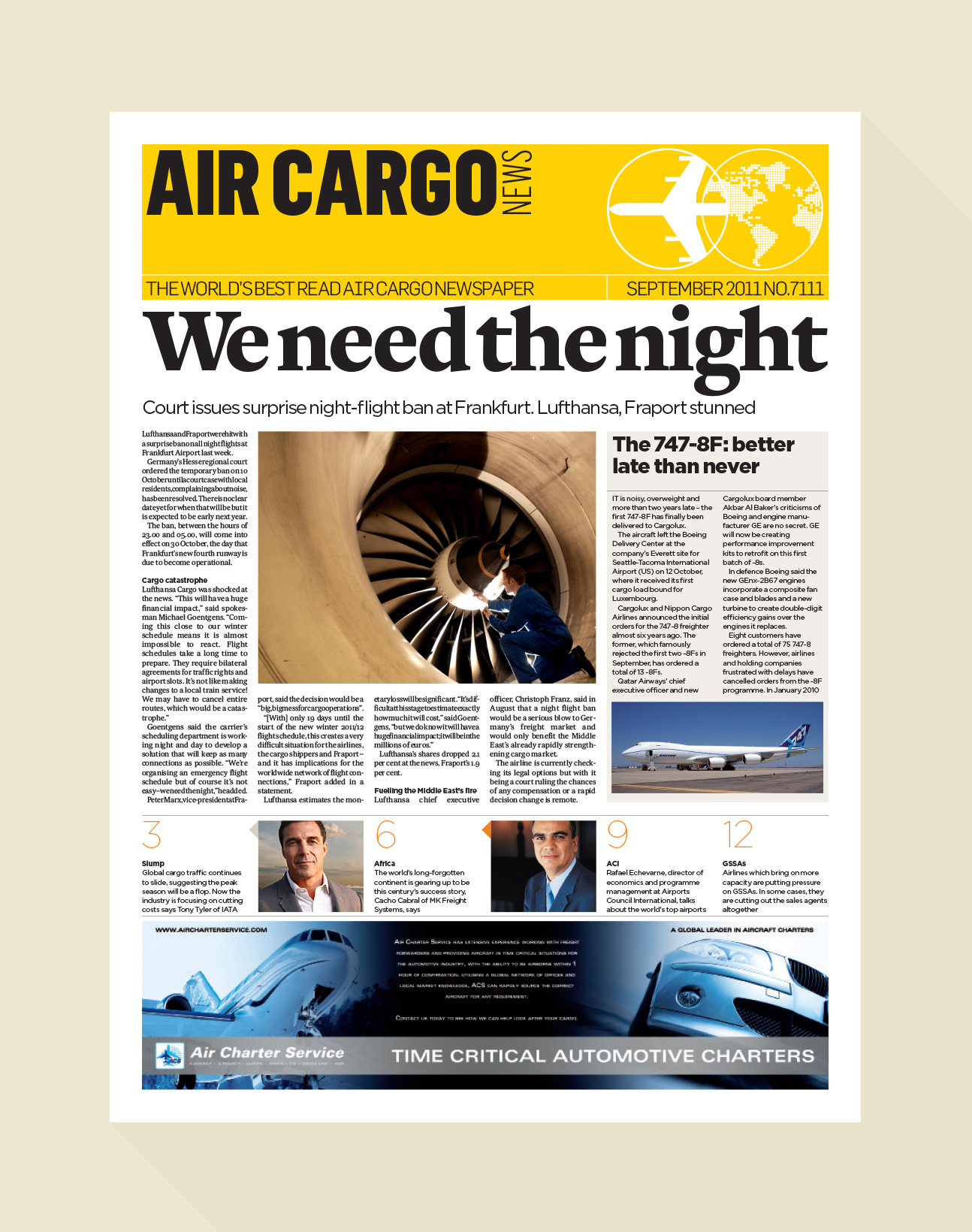
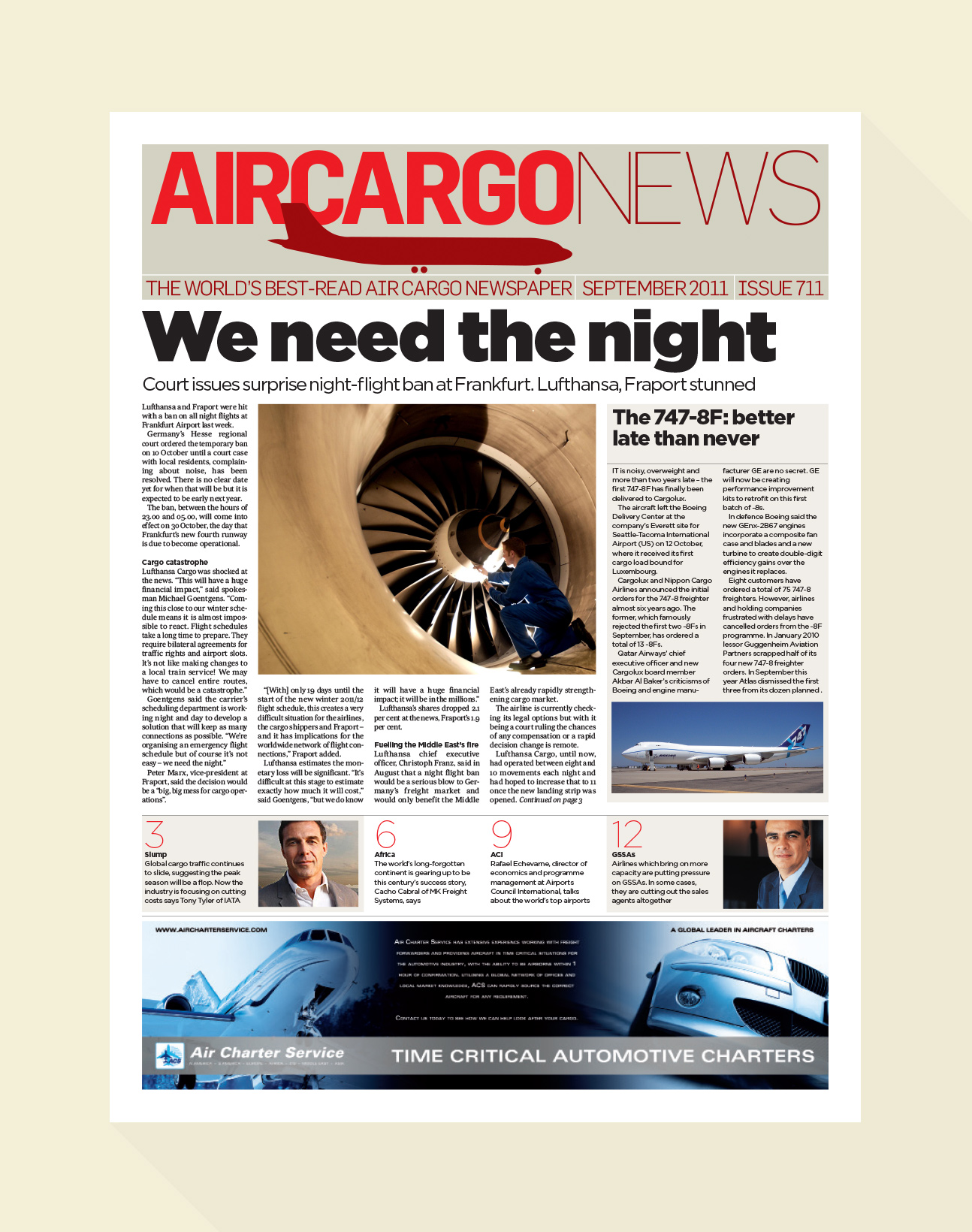
Often, your brief is that everything needs to fit. All the copy, every last word. You don’t have the leisure to make the lead image huge, to create big headlines, to open out the white space which will add that air of elegance. The copy is king. Ads are real life and so your task is to make everything fit in a better way. In a system with obvious rules that everyone can follow. What you are left with can often seem unimpressive. But you have to remember where the design has moved on from. (Above shows a spread before and after) With those eyes focused, it can make the end result feel like a really successful departure.
There’s always a bit of leeway
Amongst all those rules and regulations, there is always the possibility of bringing in some of those more luxurious elements which can shine. It’s always a good day when that happens. So that’s what I like about these sorts of projects. They might not shout the loudest in design terms, but solving these problems and creating something which has such scope for improvement always makes me feel like I have answered the brief.
The Journey
In the end, you are always trying to listen to the client’s needs, yet trying at the same time to offer them some new ideas. I like to show a breadth of options from the slight departure using all the same colours and elements to a completely new direction. Seeing the whole range of ways your magazine could look often helps crystalize where you see it going.