
Giving a talk
For the last couple of years I have been invited by Central Saint Martins to take part in a day long series of lectures for third year design students, based on ‘real world experiences’. I was asked to talk about rejection. I feel I am imminently qualified to waffle on about this subject so I agreed.
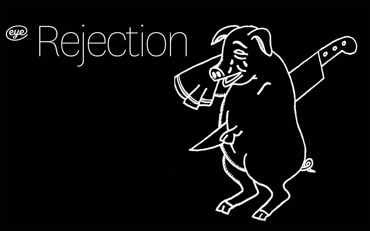
Behold the wonder that is my pig! Well, it’s not my pig. Everything you see on these slides from the talk is me drawing upon all the rich contributor work from Eye magazine, which I was the Art Editor of for many years.
One of my favourite tasks was designing the cover of each issue as it gave me license to crop, bastardize, redraw, delete, add, subtract, plus all sorts of things that under normal circumstances you wouldn’t be allowed to do to other people’s work. The brief was to create intrigue about the contents; to combine more than one story together to create a reason to turn the page. With that in mind, I plucked other people’s work up and shamelessly fiddled with it.
The weeping pig is from an article about the logos butchers use. I thought it illustrated the epitome of how it feels to be rejected which we gloss over and rationalise away. No matter what you say and how you counsel yourself, the bottom line is that when your work in rejected, for whatever reason, you yourself are rejected.One of the things experience has taught me though is that it’s never about you. It’s about flimsy opinion; a fickle beast, and other forces which dictate your answer to a brief.
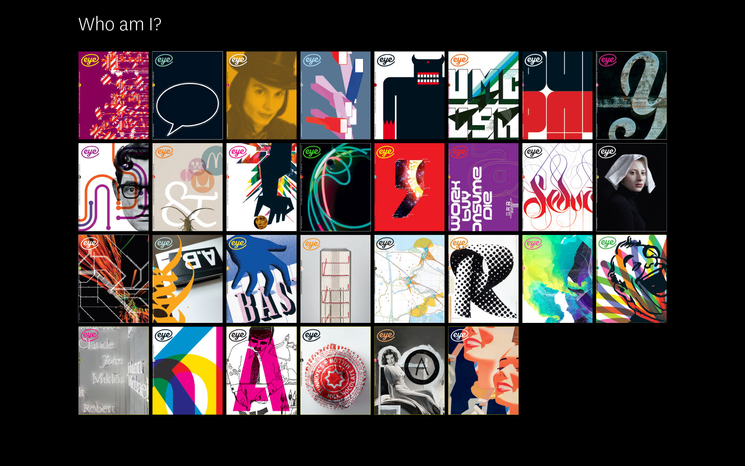
I take one project, designing the Eye magazine cover, which I did for over 10 years and use this as the example of ultimate rejection. Above is a slide of all the covers I ever created for this quarterly design journal of which I was Art Editor.
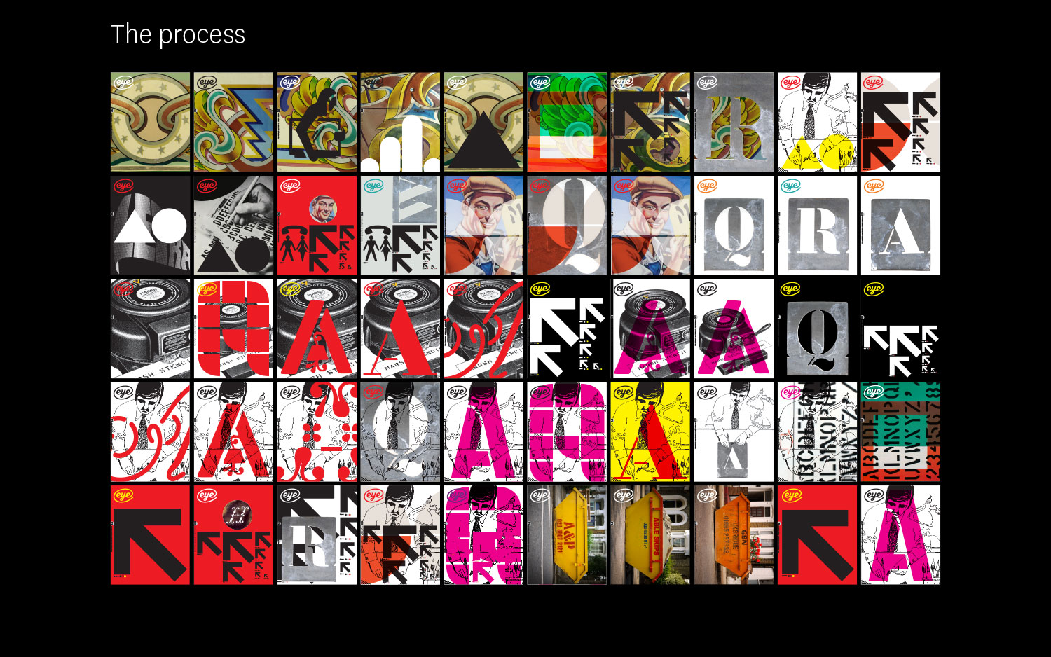
Above is the same issue, showing you all the variant design options for the cover. 90% of my work was routinely rejected with this project, because only one cover makes it and sometimes I would go through 100 variations just to get to the right one, other times 1. I don’t suggest this as best practice. Choice is not always a good thing. But in this situation, with so many possibilities, so little time, and only small windows of opportunity in which to get all the key people in the same room to sign it off, the system worked for me.
Why am I not broken by this? Because it’s meaningless graphic design? Maybe. Taking yourself not too seriously is a big life lesson. Because I don’t care? 100 cover designs would contradict this, I obviously care. Because once you know why your work is rejected it just makes more sense? This is much more the case.
In the real world there are many commercial factors which you don’t have to account for in a college environment, so I talk through everything that was a factor in creating this magazine cover. You start to realise that a cover being rejected because it is black is not so much a stab in the back but more an annoying convention. Black doesn’t sell as well. White space doesn’t sell. Eye contact sells, women sell. Some of this is bullshit. Some is fact. Some you choose to ignore. Some you are slave to. Money talks much more than you think it should. Readers being happy is a huge driver in designing a cover.
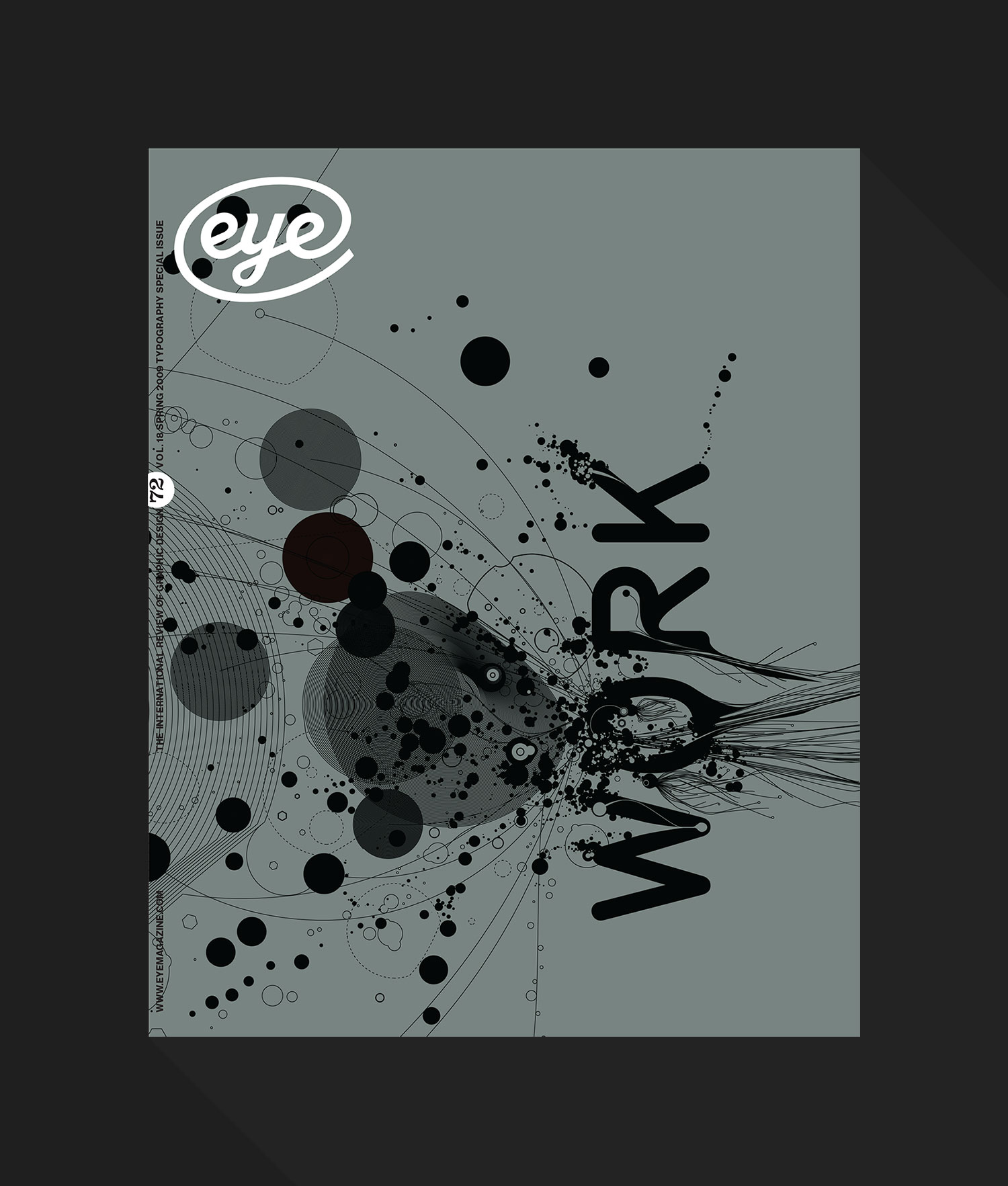
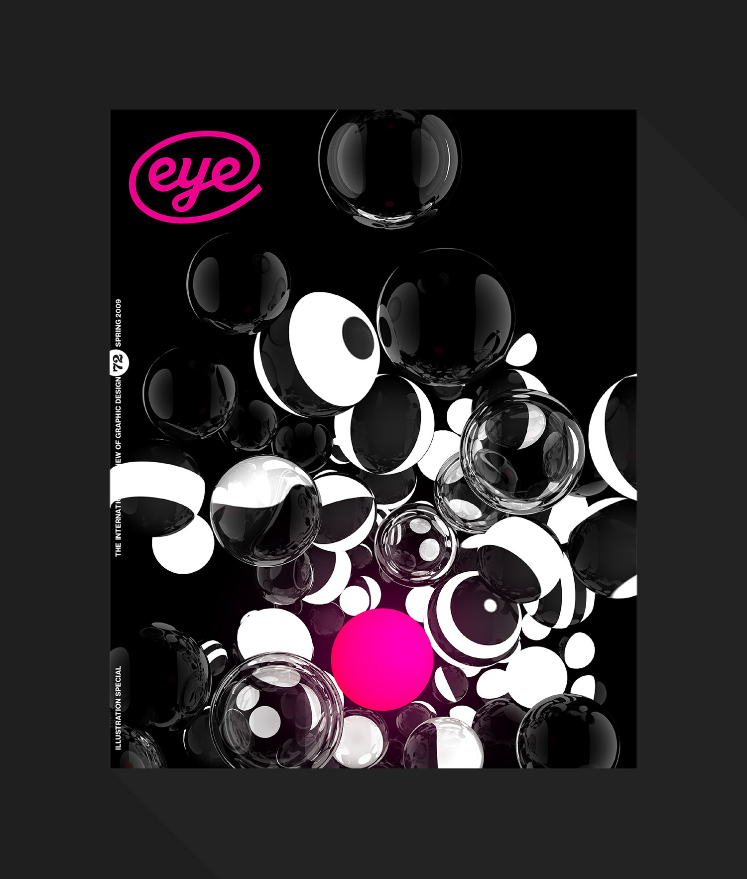
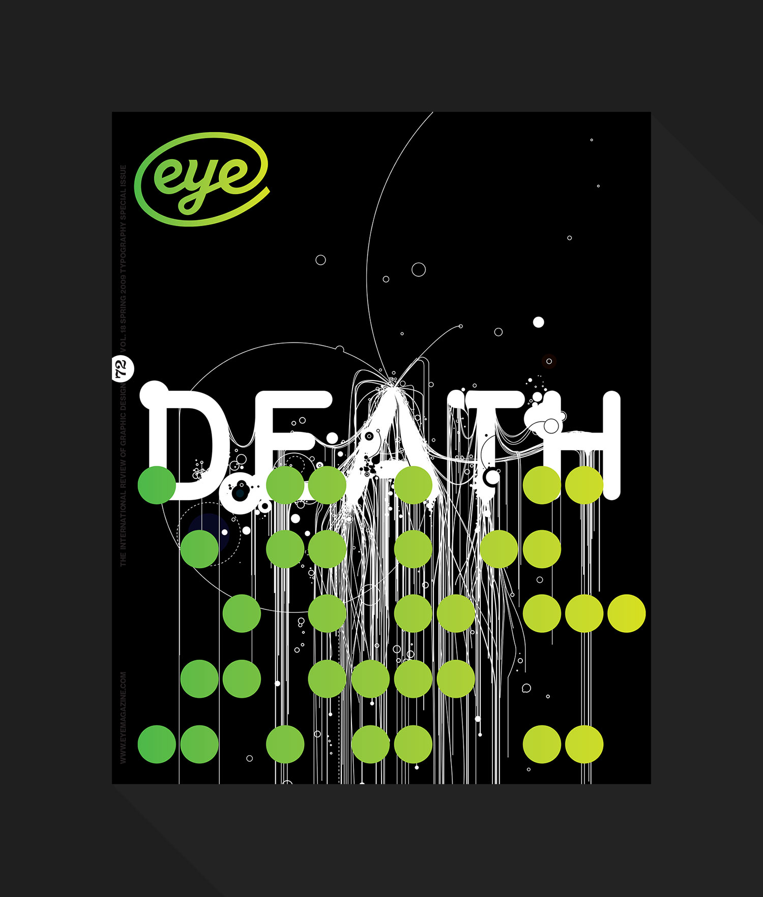
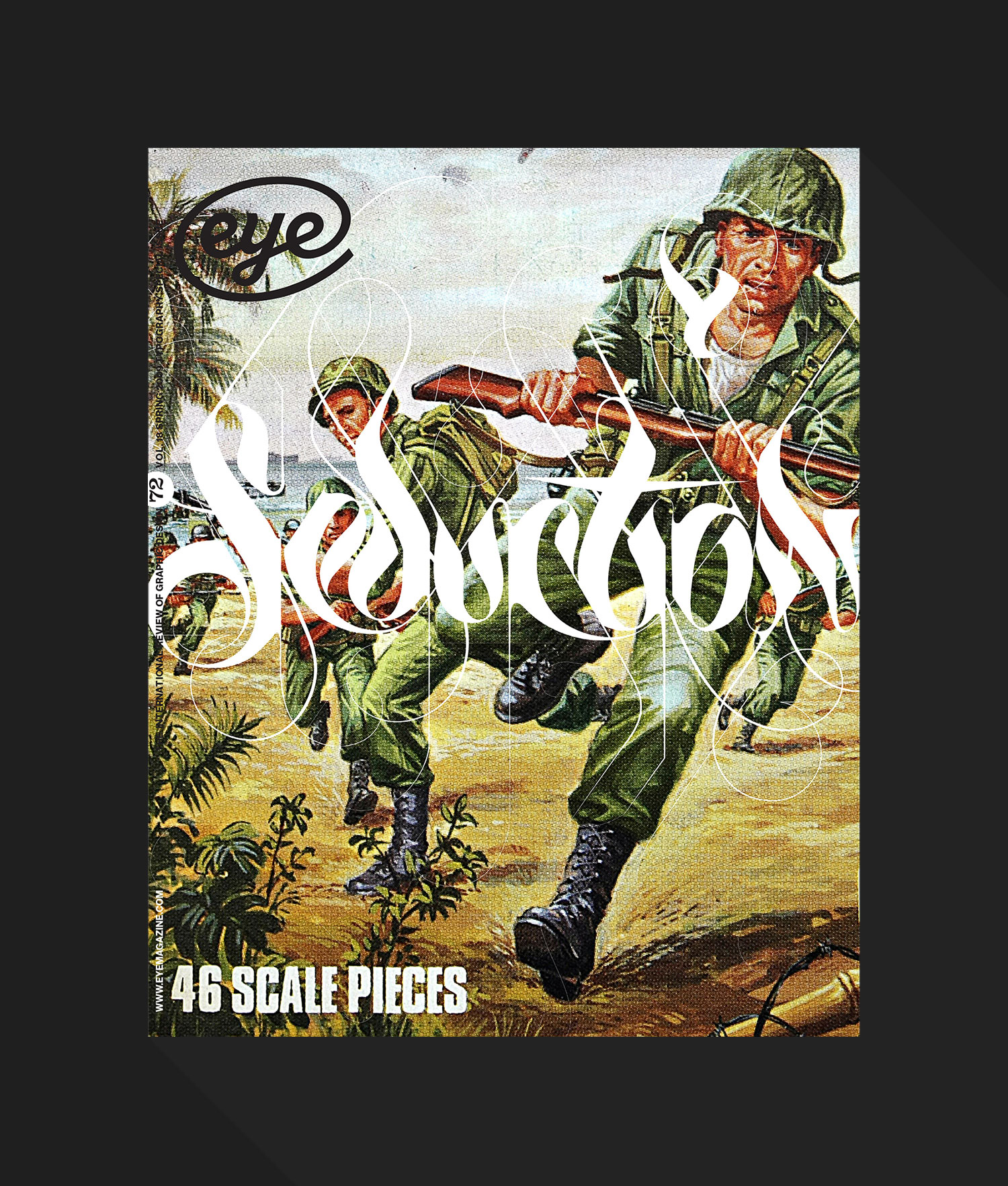
Then I take a few covers and run through each option and why it was rejected.. Some are funny, some are stupid. Some make sense, some don’t. But at the end of the day your attitude, your bullishness and your flexibility can make the process far less painful than it would seem. I loved creating the cover of this magazine. I looked forward to the battle each issue. It was my highest moment and my greatest achievement.
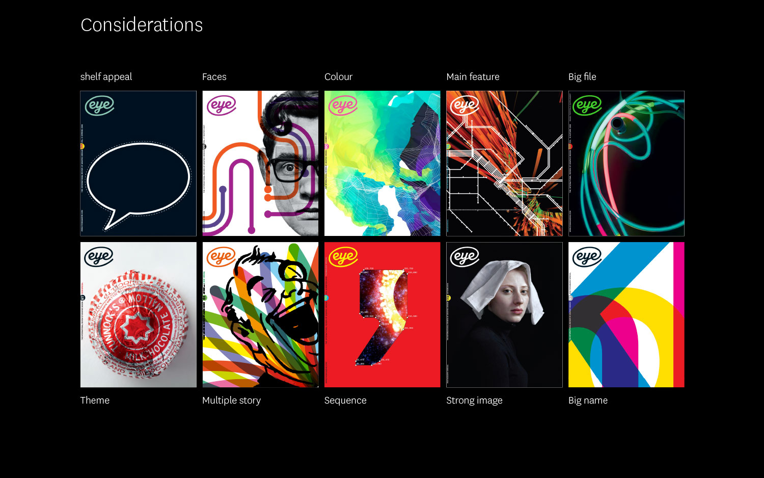
Above are all reject covers thrown on the slagheap of good ideas.
This project had some big wins, some great losses all of which I talk through if you come to my annual talk.