Before and After
The magic of befores and afters. Some things are burnt on the sacrificial alter of the graphic design gods until they are motes of charcoal floating in the breeze when they are redesigned. Others are tweaked so slightly, no one overtly notices, they just realise something is better about them.
Often the real world is about reaching a middle ground. You can’t kill what went before even if it hurts your eyeballs because it has a readership who don’t hate it enough to unsubscribe and quite like a few things about it which they will rant about if they are removed. The client might not be 100% happy with their existing product but they might be 50% happy with it, so watching you burn it before rolling out your spangly new concept doesn’t always fly.
I quite enjoy this kind of challenge and its something that crops up a lot in editorial design.
I recently worked with Mark Leeds at C-ll-ct-v-ly to redesign InAvate magazine; a trade magazine for the AV industry. It’s pretty standard to take an existing issue and work with that content when forming a new design. That way you know it’s real copy, real imagery and everyone can compare the two to help see where you suggest moving ads (gasp) or cutting copy (bigger gasp).
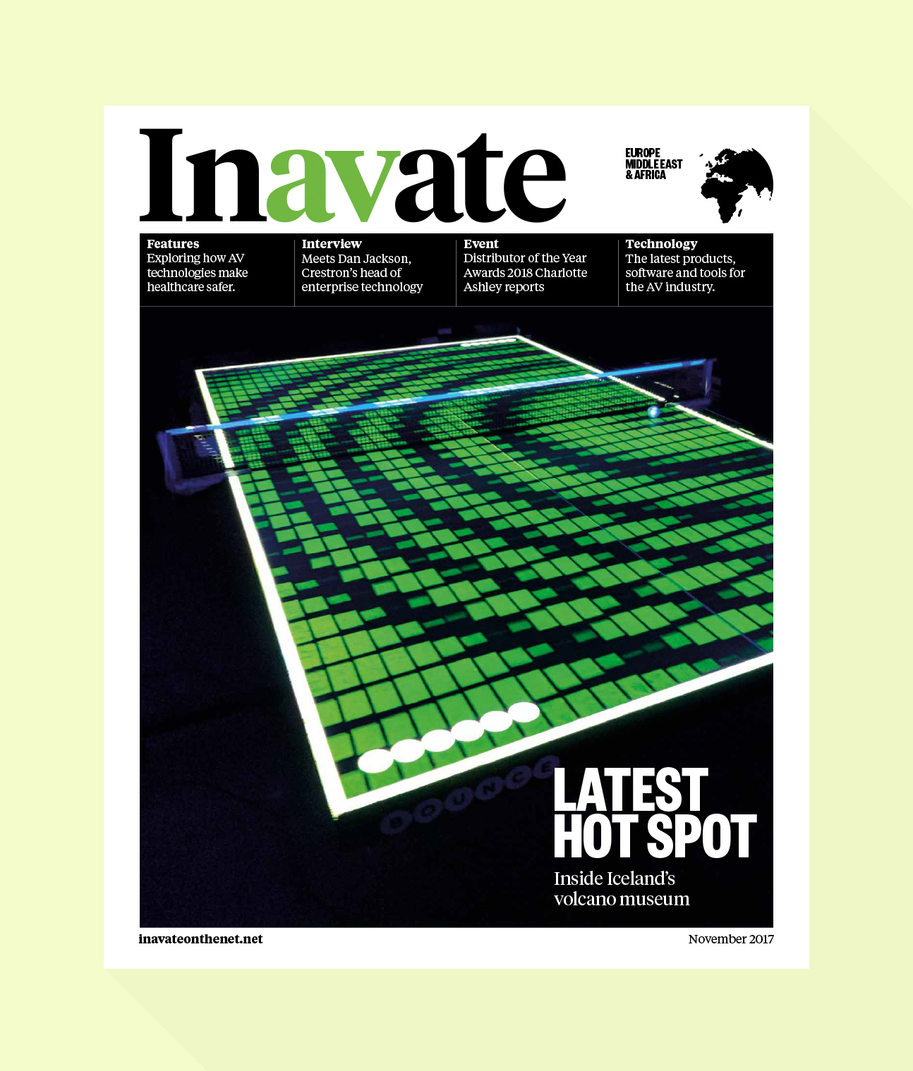
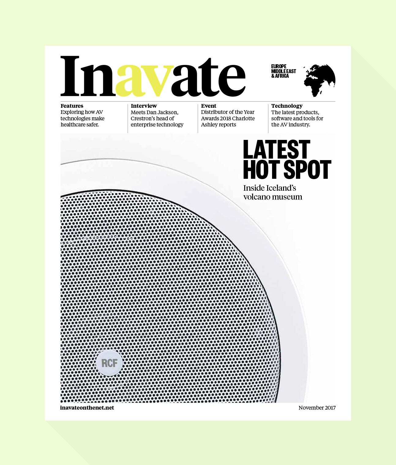
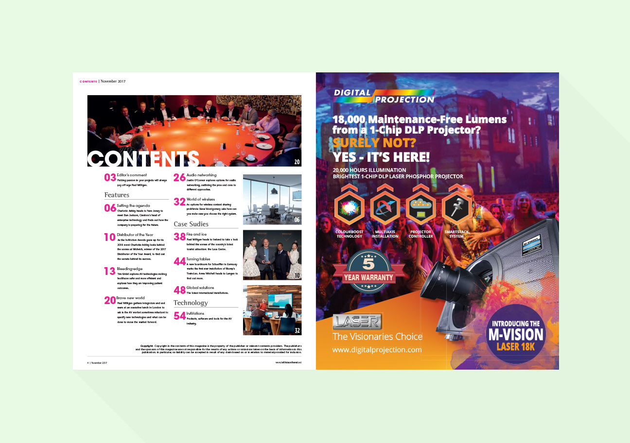
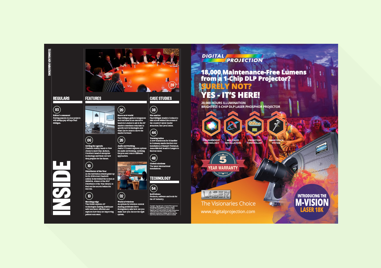
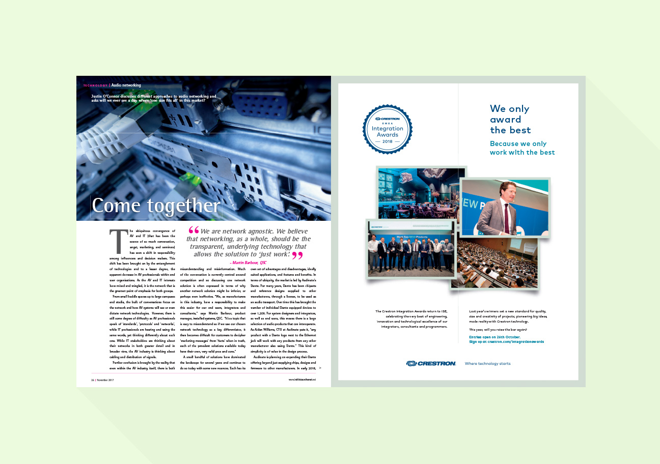
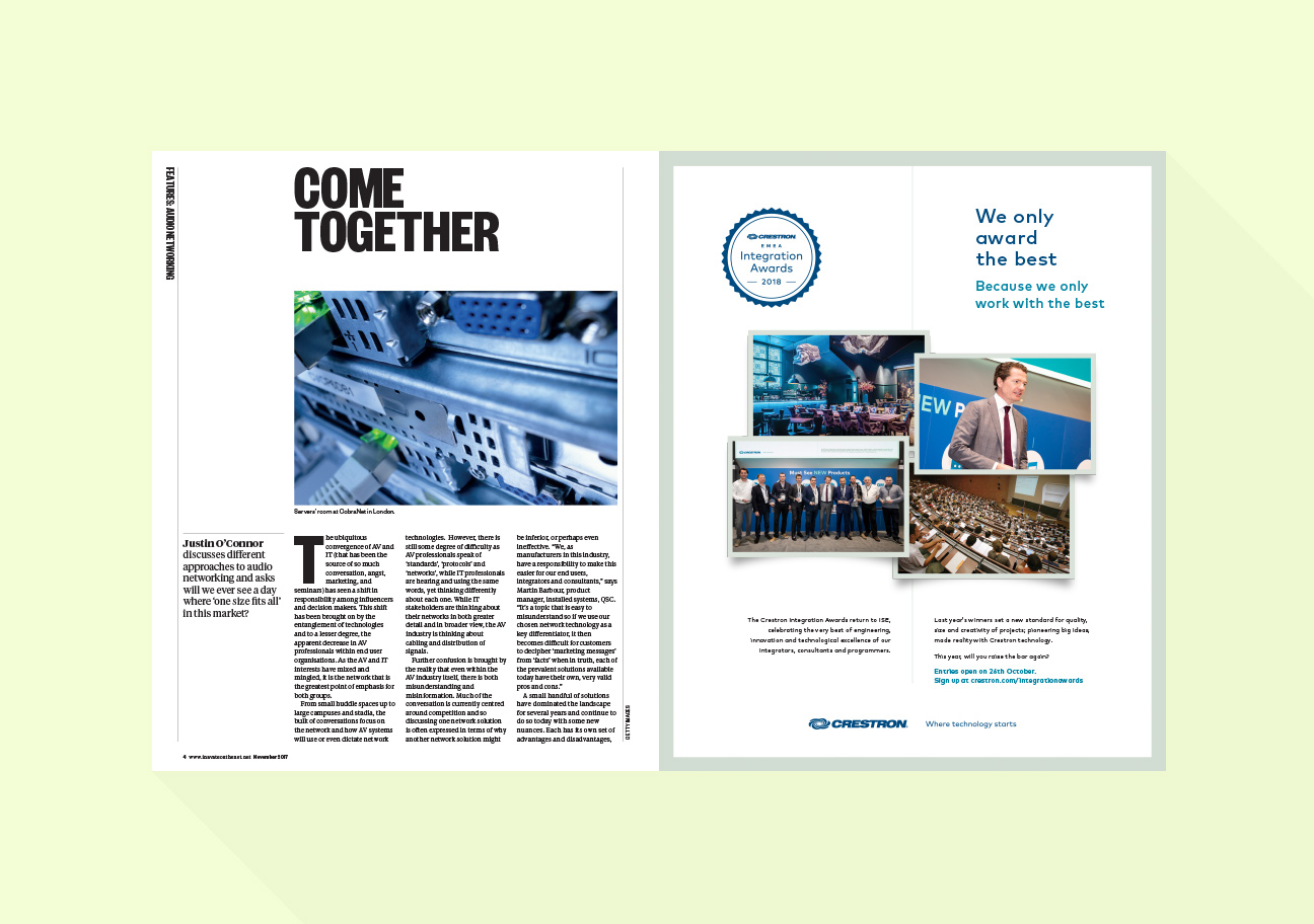
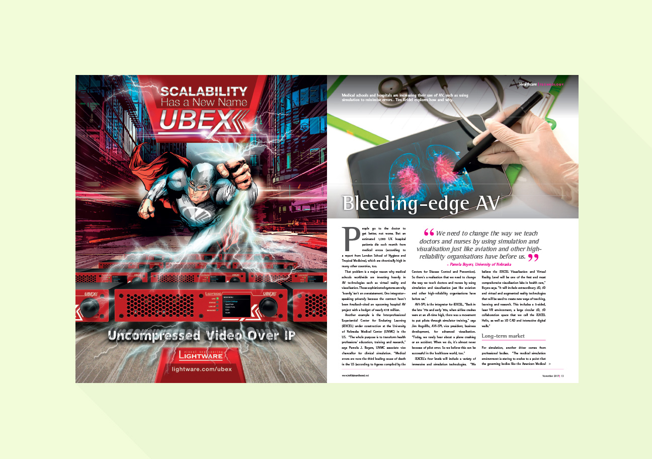
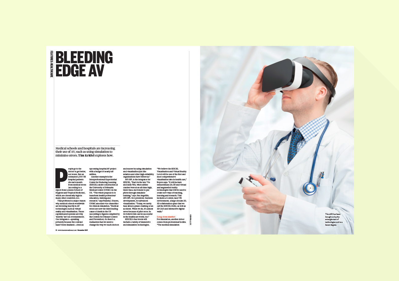
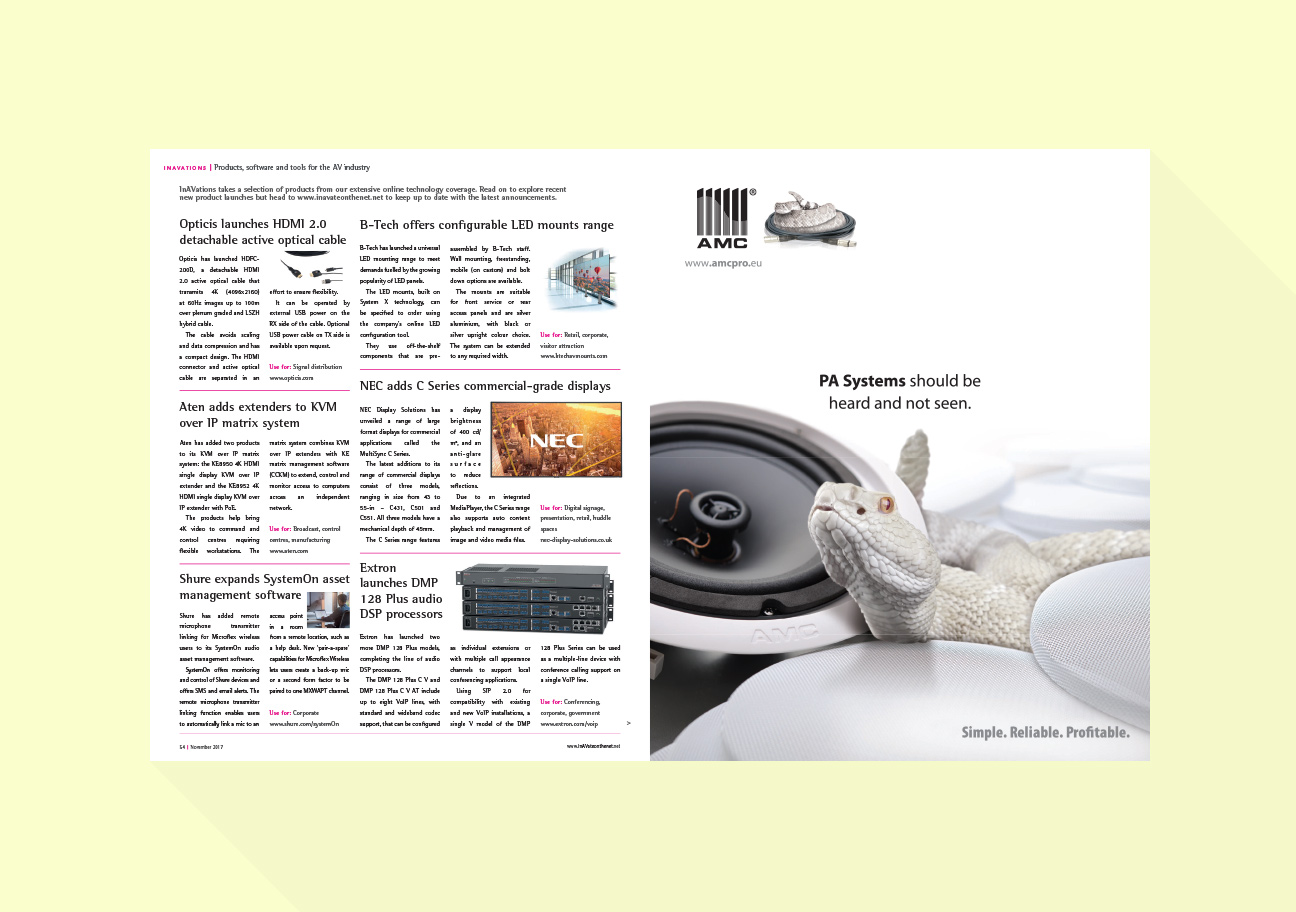
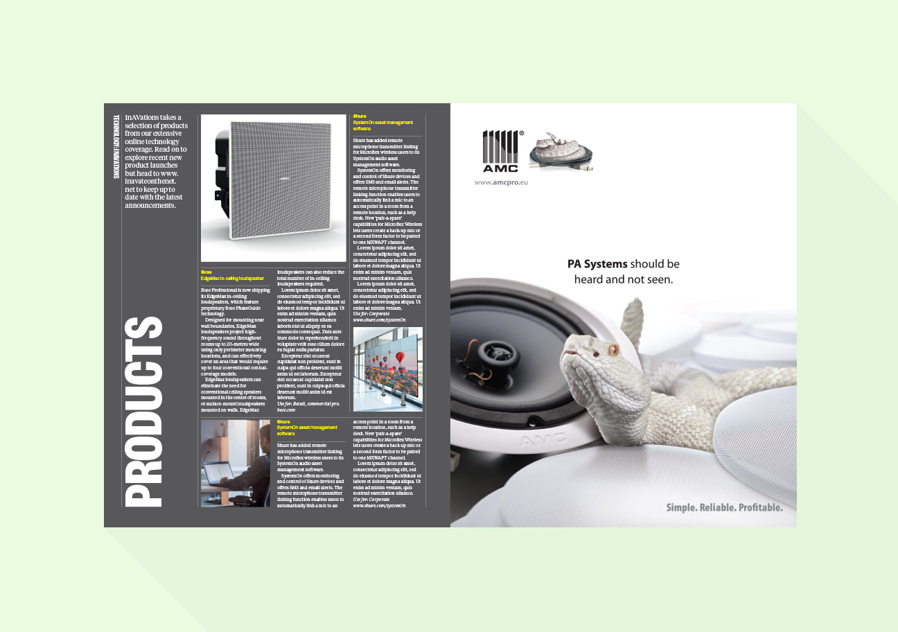
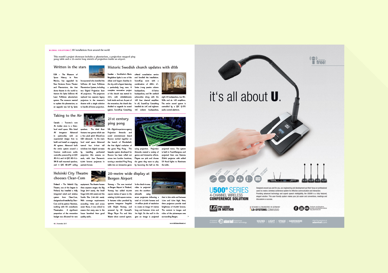
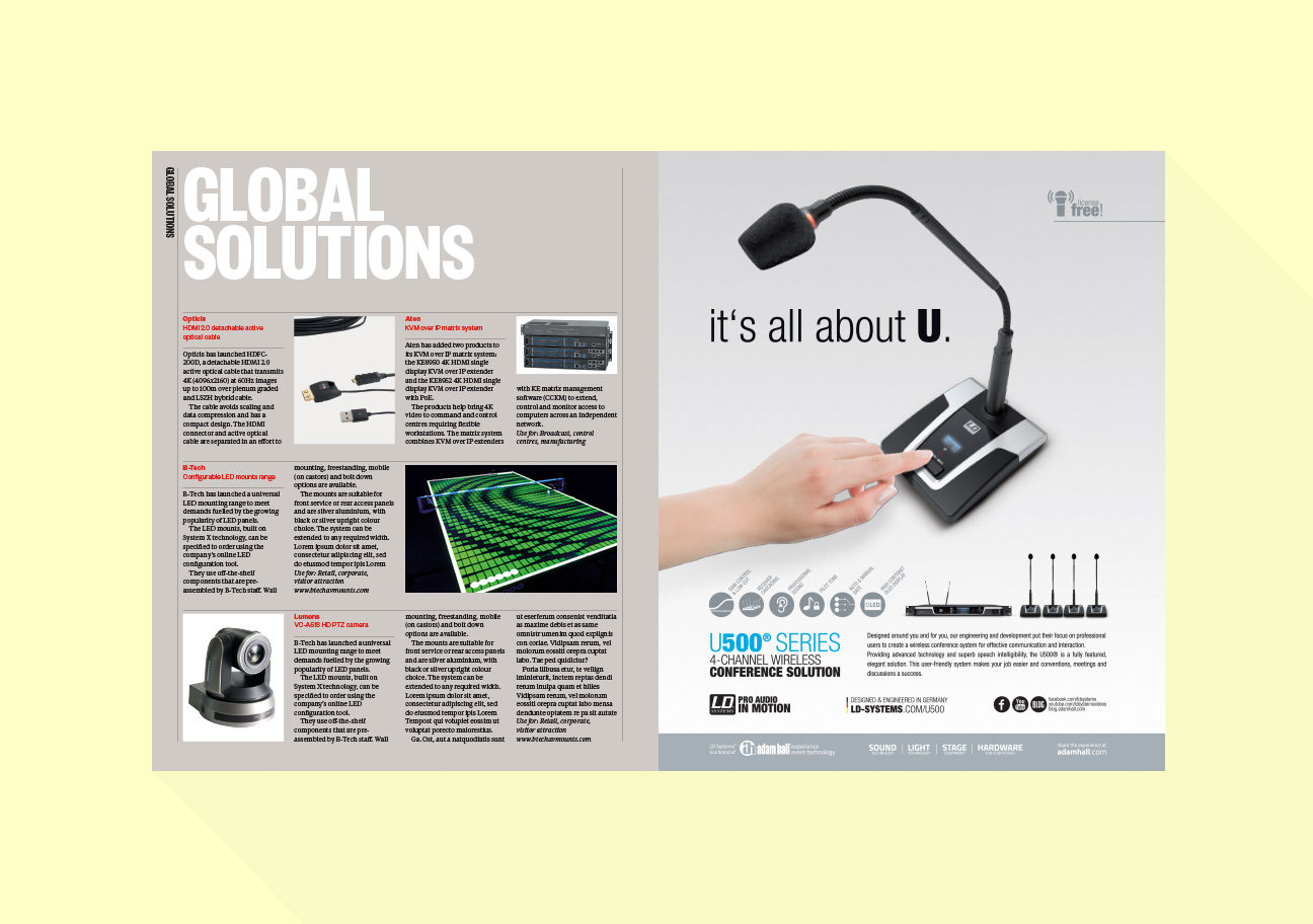
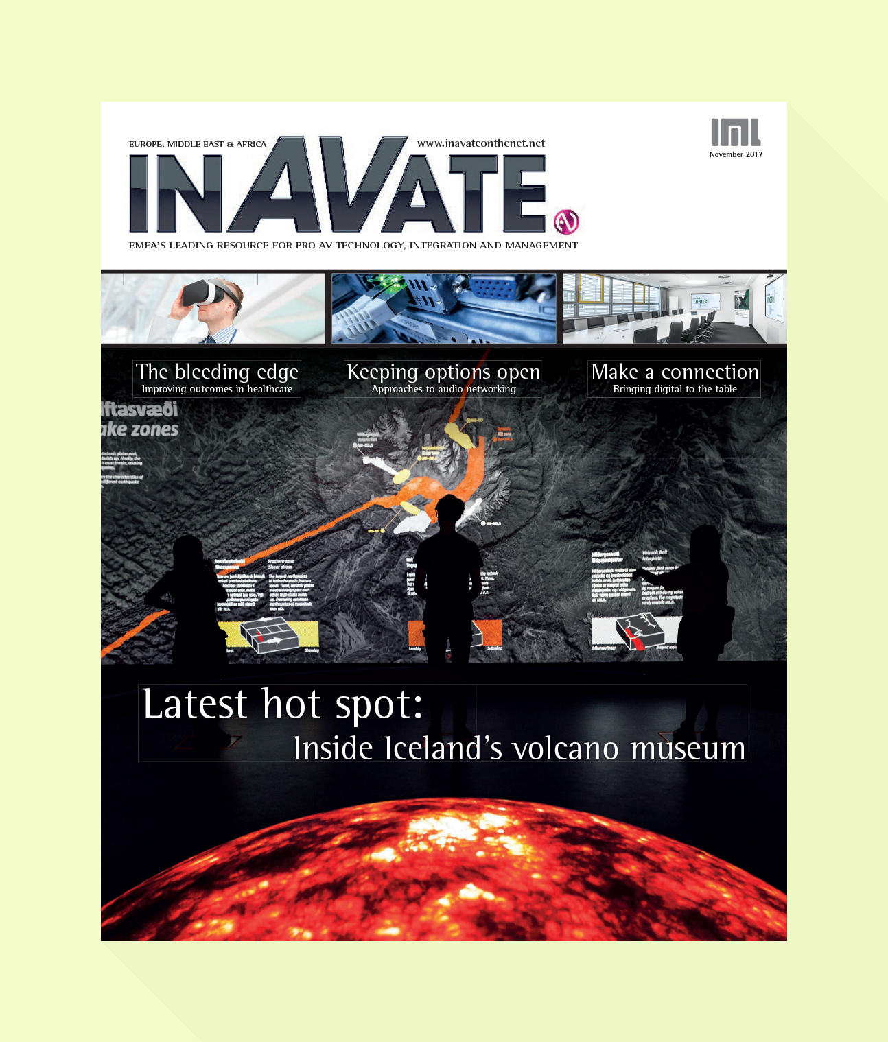
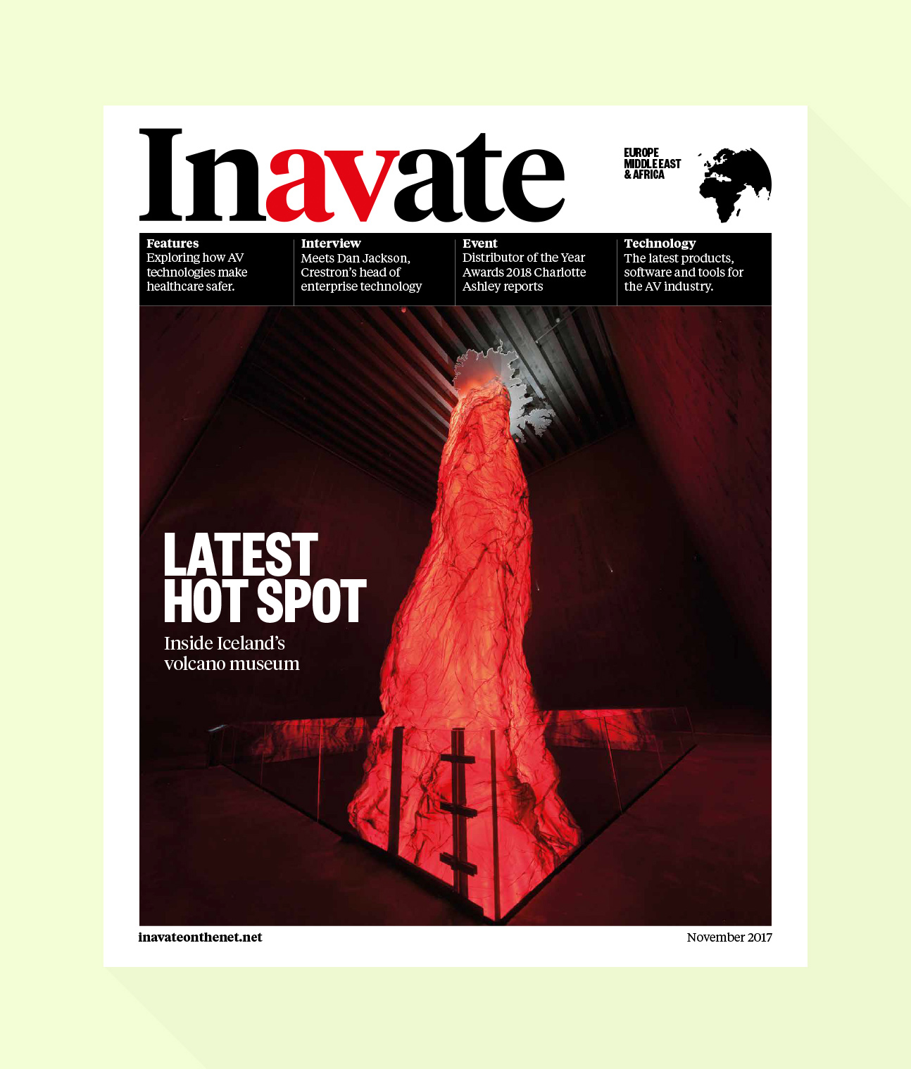
Here are some side by sides so you can see the difference. The first image is the ‘before’, the second is my ‘after’. This was not some grand redesign, more of a tidy up, looking at new fonts and a tighter layout which would add pace and help differentiate between content.
Contents
Feature
Products
Directory
Cover
Other versions of the cover